


Color Psychology for Visual Artists

Updated: May 5
Close your eyes and imagine the word raw.
What color was it? Red? The word brings to mind fresh cut meat, chapped rouge skin, blood, and intimacy. Some may even think of wrestling or smoking, in both of those cases the "raw" branding follows the color theory. The power of red is in its ability to be intense yet still versatile; it exists in seduction and love just as prevalent as it does in violence and pain. Though those are typically considered opposite sides of a spectrum, the color red ties together the reality of them all being inextricably linked.
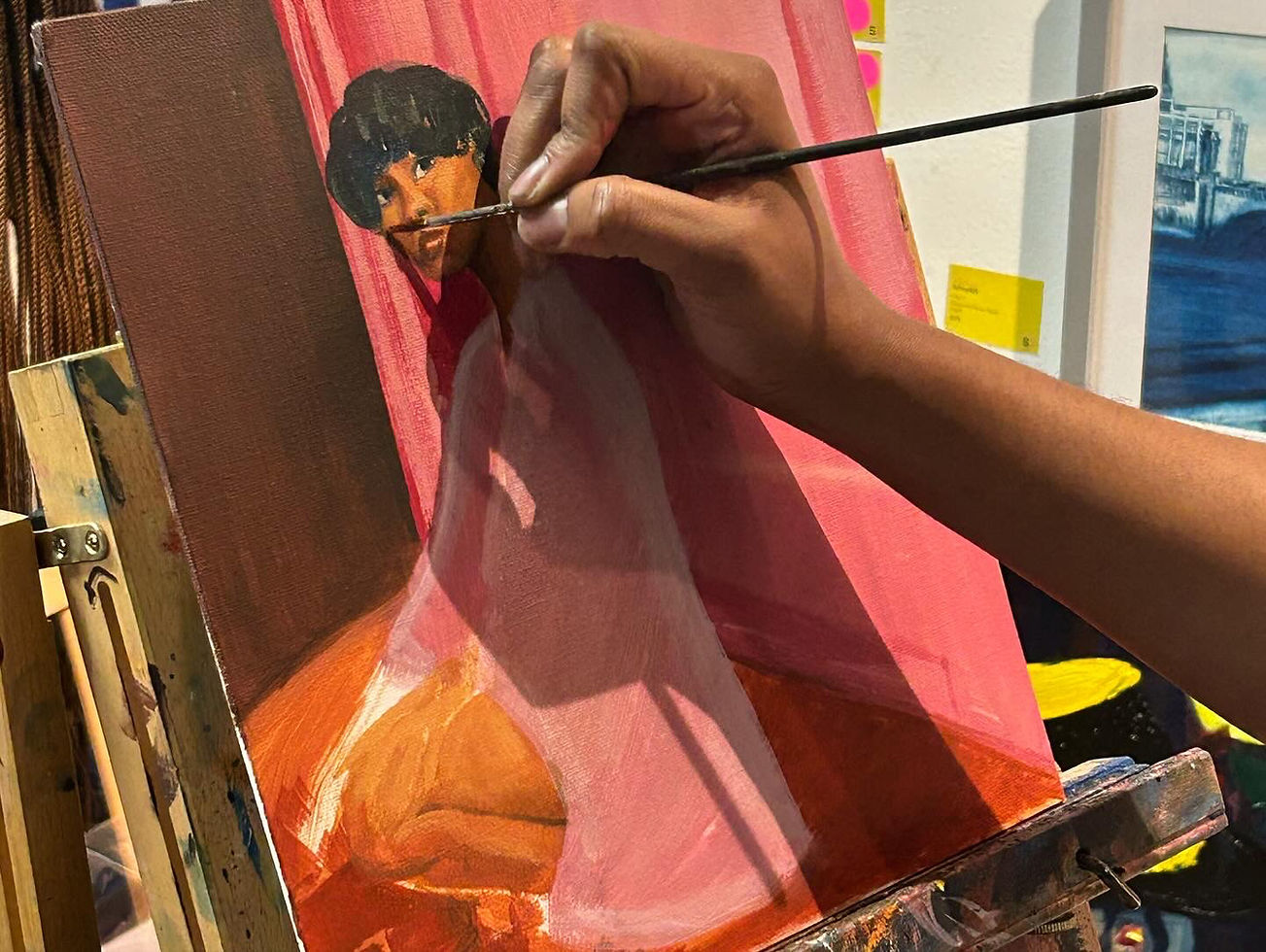
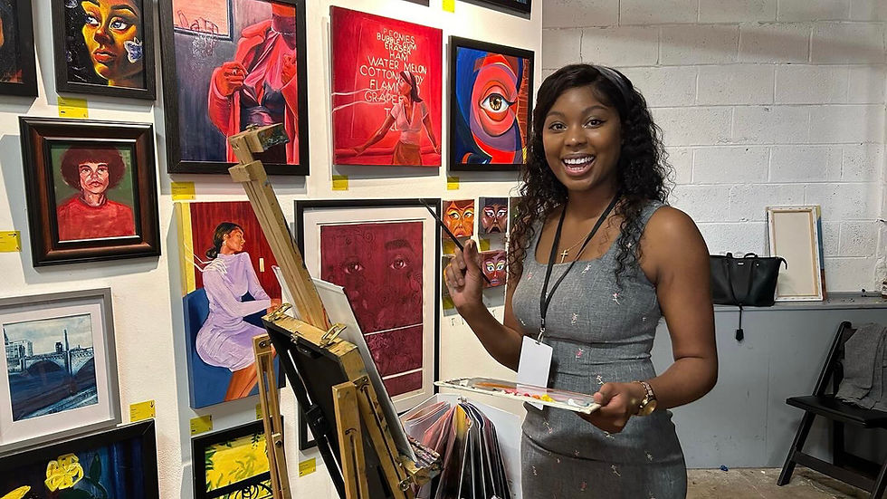
Visual art is a communication more fluent than speech, due in part to humanity's innate understanding of color as exampled. We've created color cues about temperature and safety to quickly and easily assess our surroundings and make decisions. A cycle is perpetuated; we read color and in turn write in it. As an academically trained oil painter myself, noting the effects and uses of color theory has become like breathing. I can't watch a movie or go thrifting without considering the intention or perception behind the colors.
In art and style, it is the creator's job to learn the language of color and wield it to translate that which cannot be written. In any form, the purpose of art is to feel. How deep it can reach into you depends. As a child, you dance to music with naive and innocent ears but after brain development and life experience the same songs can make your heart ache or bring tears to your eyes. Just so, a cursory glance at an artwork may supply dopamine to one while an associated recognition in it can depress another. Each interpretation is unique, so the question becomes how to make art that is clear, to the creator at the very least. This text offers a crash course on color theory and how color is interpreted while giving you the tools to start activating your own story whether that be in art, fashion, design, marketing, film, or anything you may create for viewing pleasure.
THE COLORFUL HISTORY
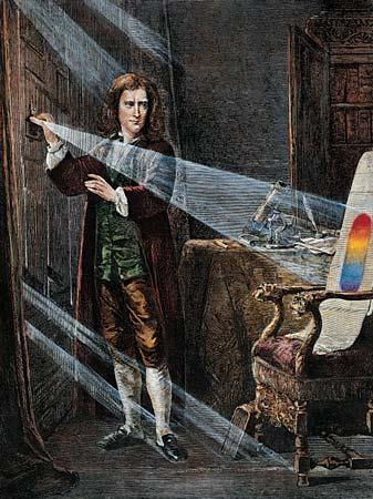
To understand anything, it is good practice to learn it's background. The Smithsonian Libraries tells us in The Science of Color that the first known color theory was offered by Aristotle. He claimed every color was a combination of black and white or light and dark and qualified his idea by integrating the four elements. We know now that any mix of black and white will surely give us greys, but the Aristotelian view was actually held for 2,000 years until it was challenged by Newton. Yep, hit in the head with an apple Newton. The "English physicist and mathematician Isaac Newton began a series of experiments with sunlight and prisms" in the 1660s. This led to the discovery our 7-color visible light spectrum ROYGBIV (red, orange, yellow, green, blue, indigo, violet).
What does this have to do with being a creator? Well, in response to the more scientific exploration of the Newtonian theory, Johann Wolfgang von Goethe begins our journey into color's emotional relevance highlighting what Smithsonian relays as "a subjective experience perceived differently by each viewer."

At the cross between perception and science, there are various factors that can produce different interpretations of the same color. Color is the light waves reflected back or emitted into our eyes by an object. Variables include light quality and source, eye receptiveness, color blindness, and even lifestyle factors. The last was revealed by an NYU study sparked from a viral illusion in recent history, simply called The Dress.
In 2015, this dress (fig.2) caused a great divide, some saw it as blue and black (myself included) while others saw gold and white. As we talked about earlier, light carries different colors. You imagine a certain color light when thinking of an old library and a different color when calling to mind a hospital. NYU neuroscientist Pascal Wallisch's study "suggests that whatever kind of light one is typically exposed to influences how one perceives color". With such a vast set of circumstances changing how color is received by an individual, it can be difficult to decide not only what color to use in your own work, but what it will say. Thankfully there is a simple way to decide.
PERSONAL STYLE
A personal rule of thumb I use for my paintings is one you may have heard before: trust your gut. The advice is twofold:
1. your creation should be just that, yours
2. your unique story may not be as unique as you think
I mean the second in the best way possible. Some out there will be able to appreciate your perspective, some will understand, some may learn, and some will relate. Not everyone is going to get it and not everyone is going to like it, accepting that is key. Believe it or not, some people don't like chocolate. That doesn't make chocolate void of antioxidants, take away its aphrodisiac effects, or tank sales. A true artist creates for themselves.
Once we begin introspection, we've arrived at the fun part, notice what colors make you feel what ways. Take a look at figure 3. Color science has been widely studied, and a general key has been devised of what colors evoke what feelings. Of course, this doesn't span every single possibility or mean that you will agree, but it is a starting point.

Contrary to the figure above, I feel blue is the cleanest color. This shows in my life in ways that comfort me whether they are effectual or not. My shower curtain, bathroom rugs, sponges, dishes, clothes detergent, pillows, favorite towels, and exfoliating gloves are all blue even the gum I chew comes in a blue pack. It is not my favorite color, but each thing makes sense for how I experience blue. You may do the same without realizing it. Look around, notice the colors you interact with and how they make you feel. This challenge will move their effects from a latent subconscious into a studious consciousness and is well worth it. New agency is born when someone learns to recognize what influences them. A salesman at your door may wear blue to manufacture trust but now you can see past that and realize you actually don't need new gutters.
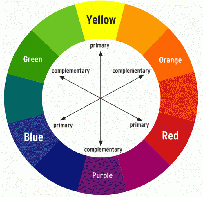
Thus far we have been speaking in monochrome. Though it is good to see how colors stand on their own, that is rarely how life presents them. In any work, they will interact with each other just as much as they do with viewers. There are a few basic relationships easily identified on a color wheel. The three primary colors (red, yellow, and blue) mix to create the secondary colors (orange, green, and purple). Colors across from each other on the color wheel are complementary colors meaning they can both help the other shine or dull it. In autumn the first leaf to turn red stands out a lot more surrounded by its complement green. On the other hand, complementary always colors mix across to create brown. There is more we can analyze here but that will be for another day.
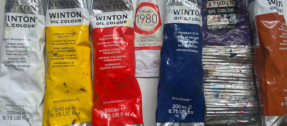
When it comes to mixing color, the possibilities are endless. Artists often naturally edit down their starting paints to selected favorites; these limited palettes create a natural harmony. Myself, I always keep soft mixing white, cadmium yellow, alizarin crimson, napthol red, prussian blue, dioxazine purple, and burnt sienna. I may feature another here and there but in my time painting, I have found they work well together, both juxtaposed and intermingled. For each artist and style the palette will be different. A rule of thumb I tend follow is avoiding pure black or much white on the canvas. It creates a more unique visual interest when the darkest value is derived from a deep purple and the lightest is a bright yellow.
EXPERIMENTATION
The way to build your own brand and style is to find what you like. Much like picking the paints, the only way you will see what mixes well and what muddies is through trial and error. Clarity about what you want can come from clarity about what you don't. Though, this process is not done in a bubble. A budding artist gets critique and feedback on their creations. Look at who feels spoken to and who doesn't. When getting aid in finding yourself, do not forget to always consider the source. There will be times that you hit a wall with people you are trying to reach and there are other times you will need to filter out opinions of those who are never going to see your vision.
In my rare case, as someone who never stopped pursuing art and was classically trained by practicing artist among likeminded peers for almost a decade, I will impart some ways I believe to be good resources for any visual worker. 1) Physically go into your field, you are what you eat 2) Recreate old master works, this will show you how the experts solve problems 3) Find leaders in the field today, consume what they produce and connect with them if you can 4) Act, ready may never come but today is already here. The earlier you make mistakes the faster you can learn to solve them.
Bonus: never be afraid to start over. After my many years in academia it was easy for me to feel I had become a mash of skills without a real direction. They cannot teach you that in art school as much as they may encourage you to figure it out. Keep a log of your true interests and things that you are passionate about. Knowing yourself is how you find your voice. It may be an ongoing process but it's worth it to love what you create.
Like any skill, your eye will take time to develop, but once you begin to see like an artist, you never lose it. The more you tune in to color commentary the more fluent you will become. Learning the language of color, though intuitive, is a lifelong endeavor. As times change and the state of the world moves through different periods, context will inform interpretation. Just how red can feel romantic in love, it can feel like danger after heartbreak. Build a sense for human psychology and brush up on current events to feed your learning. Even art made by the oblivious is not made in a bubble, sacrifice pride to offer something truthful. A look at art history will tell you, true beauty embraces narrative.
-----
Thank you for reading! I hope this has been a fruitful addition to your learning. I’d love to hear any questions or comments through email at altakoer@gmail.com. Be sure to subscribe to stay in the know of upcoming posts. You can talk to me on TwitchTV Tuesday, Thursday, and most Sundays at 6pm and follow me on instagram @altakoer for more content.
Comments